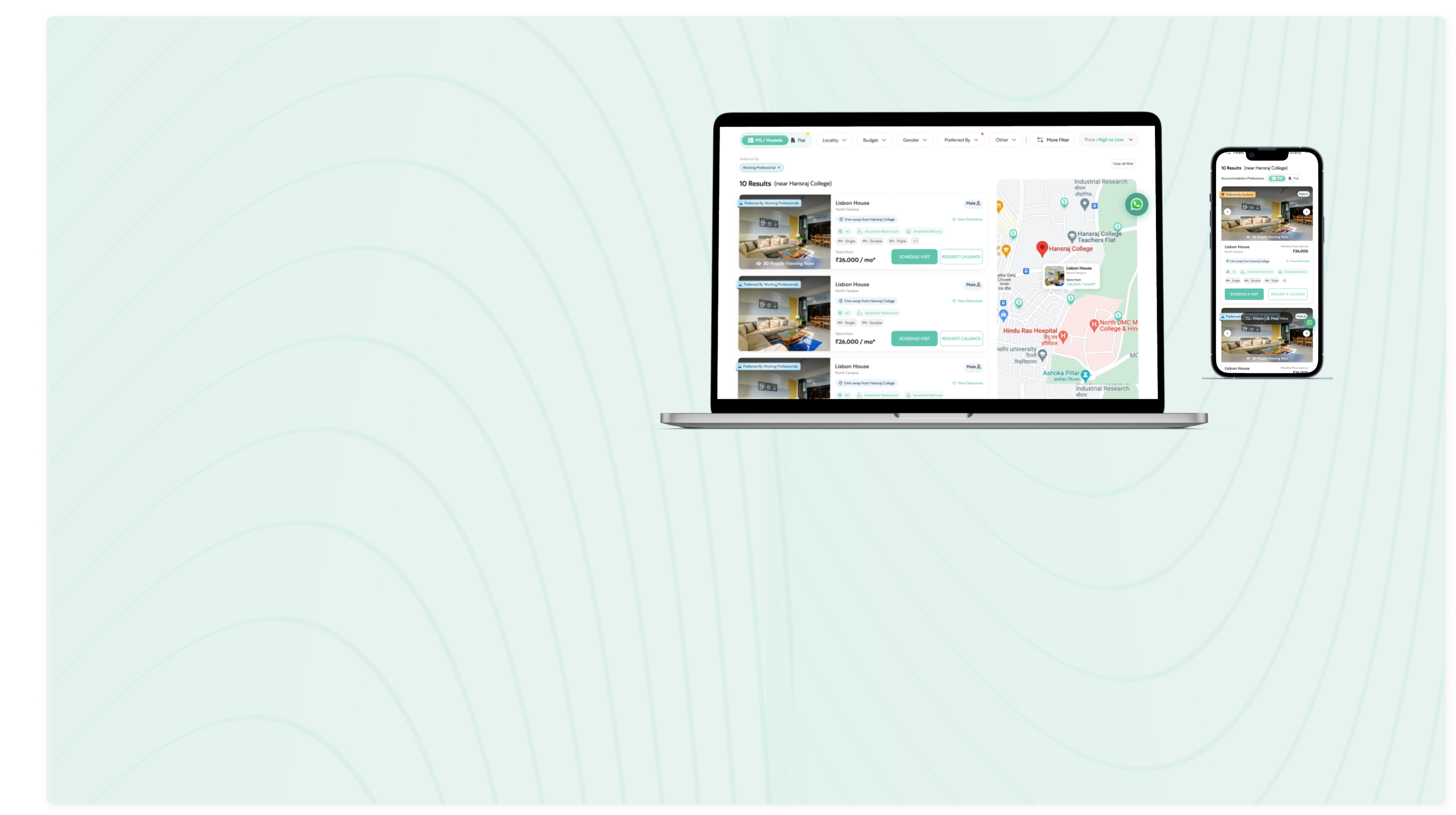
Redesigned Listing page
for Website & Mobile

Project Overview
Stanza Living is dedicated to elevating UI through regular website revamps every 5 to 6 months. These updates strategically introduce new and consistently engaging elements, ensuring user consistently encounter fresh and new things. By prioritizing continuous improvement, Stanza Living demonstrates a commitment to innovation that aims to captivate users with novel features. The goal is to foster a dynamic and engaging online environment, providing users with a consistently evolving and appealing digital space through these regular UX-focused updates.
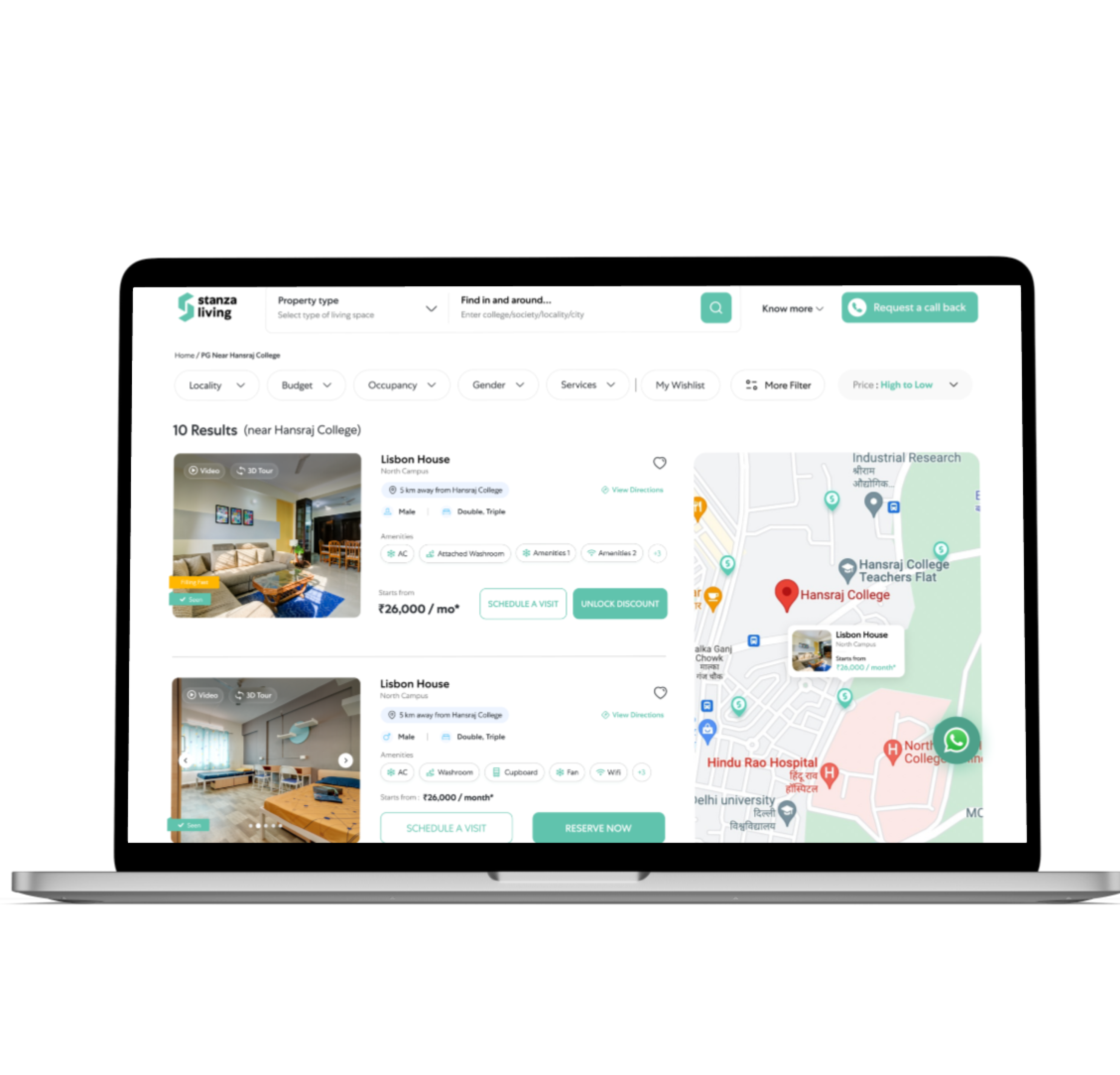
I redesigned the listing page for both desktop and mobile in which new elements appeared on the listing card as follows:
- X people viewing now
- New Fomo tags
- Preferred by Student or Working Professional Tag

Design Process


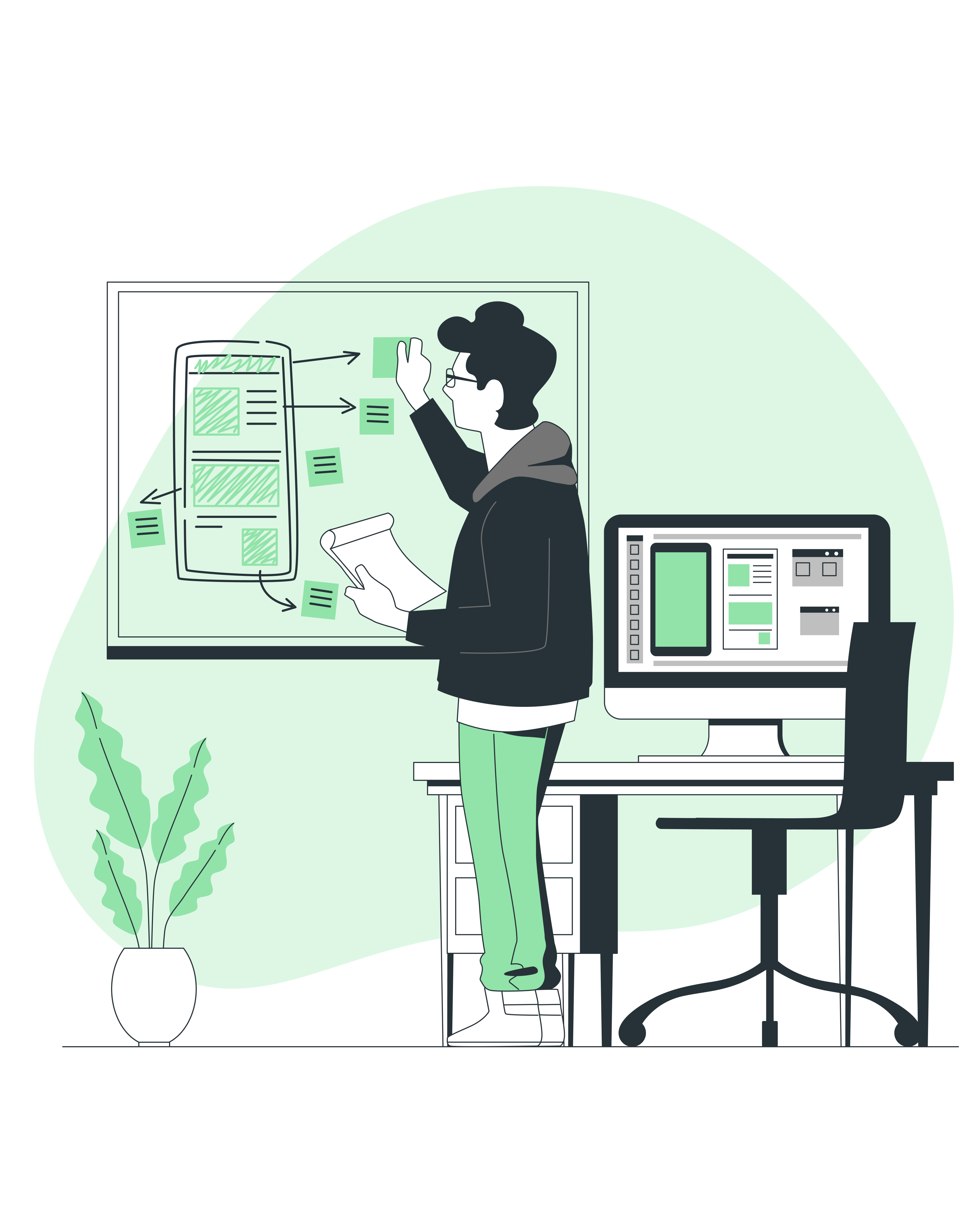
Challenge & Research
Approach & Ideation
Visual Prototype

Result & Evaluation
The Challenge


Issues with the Current Website at First Glance
I inspected the website and noted a few details:
- The gender chips were inconsistent.
- Occupancy chips were not clear.
- User were not clicking on Video & 3D Tour chips.
- Separation between two cards was not clear.
- People aren't using Heart for wishlisting any property.
- Excessive Tags were seen on the image which were distracting the user.
As I gained better understanding of the website at that time, I then proceeded with next step to conduct research over direct & indirect competitors from the industry.

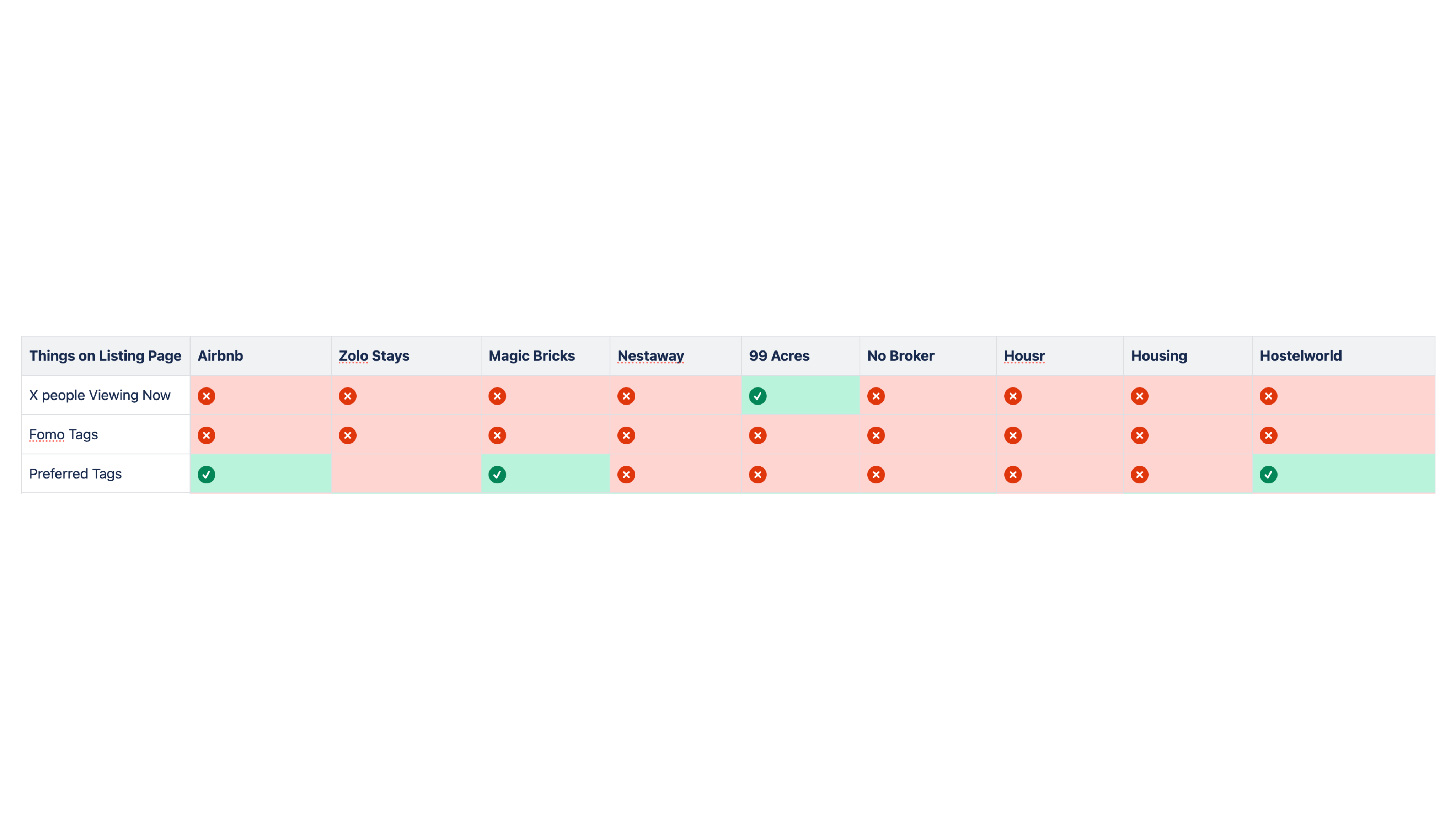
Competitive Analysis
During the research I identified the company's direct & Indirect competitors and carried out a competitive analysis in the form of a feature comparison matrix

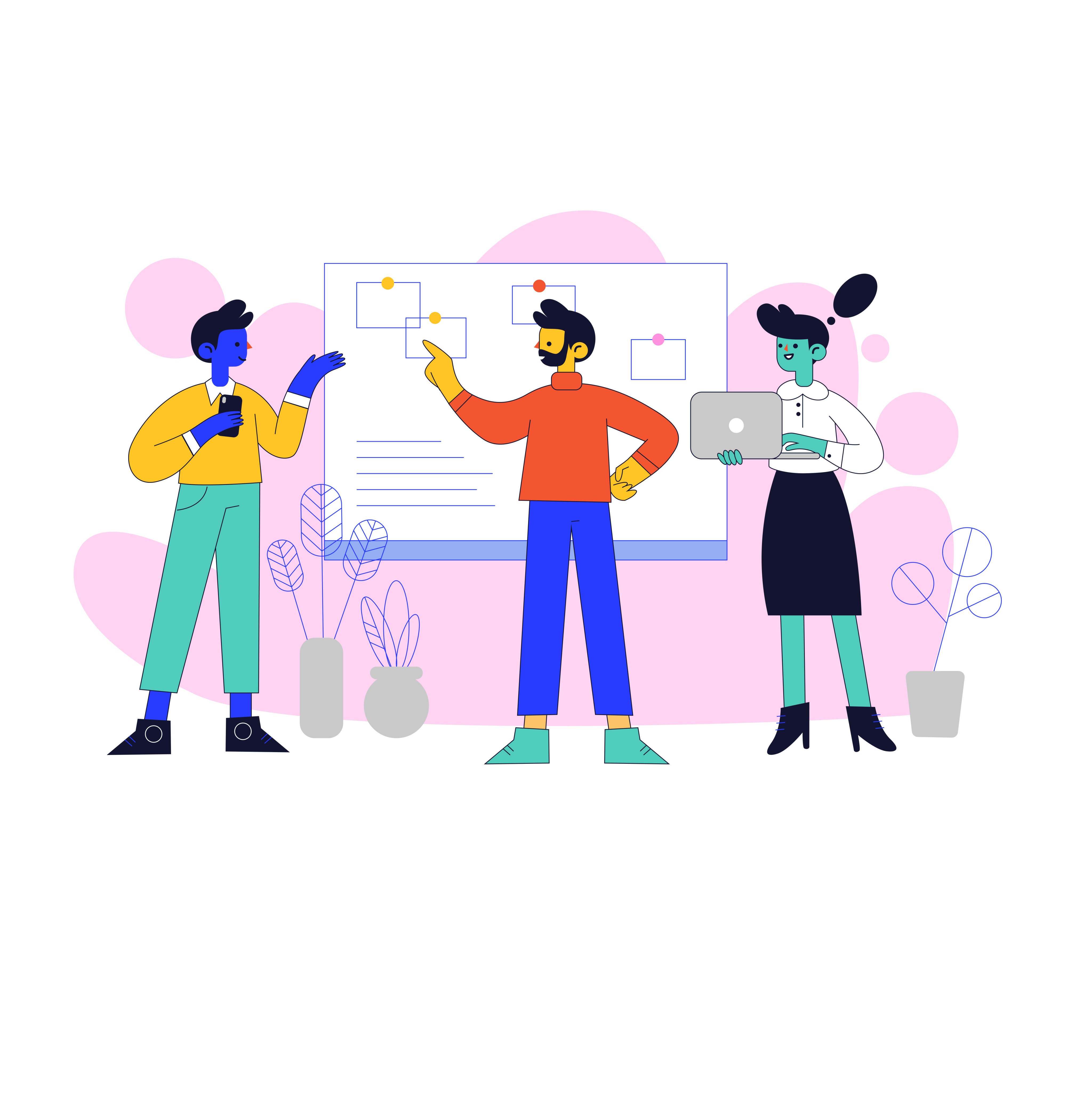
Approach & Ideation
Based on the above findings, I started iterating and adding the element & screens there were necessary to reach the user's goals.
I created 4 options in Figma and discussed them with other stakeholders and got valuable feedback.
Option 1
• Rating and Gender were made in a single chips and placed on the right side of the card
• Adding same colour for Amenities, Occupancy & Distance
• Fomo Chip made and placed bottom of the image
• X people viewing now chip made and placed over the image
Option 2
• Rating and Gender were made in a single chips and placed on the right side of the card
• Adding Amenities, Occupancy in a outline box
• Fomo Chip made and placed bottom of the image
• X people viewing now chip made and placed over the image
Option 3
• Rating and Gender were made in a single chips and placed on the right side of the card
• Adding Amenities, Occupancy in a container
• Fomo Chip made and placed bottom of the image
• X people viewing now chip made and placed over the image
• Seen tag also placed over the image
Option 4
• Rating and Gender were made in a different chips and placed side by side on the right side of the card
• Made Two Chips with different colour and assigned one for amenities and other for Occupancy
• Preferred tag made and placed on top of the image
• X people viewing now chip and other fomo Tags made and placed at bottom of the image
• Card has been made for every property where all the relevant information were added
Insights
Key Insights Derived from above Approaches:
• Following Option 1 will not be suitable because there is no visually difference between Amenities, Occupancy & Distance as hence it will confuse the user.
• Following Option 2 & 3 will not be suitable because as visually it looks very basic and not appealing
• Following option 4 is minimalist all the things are placed in a way it will easy for a customer to scan and understand
• The only drawback was we do not have enough data on rating for all the properties hence we decided to remove the rating as of now.
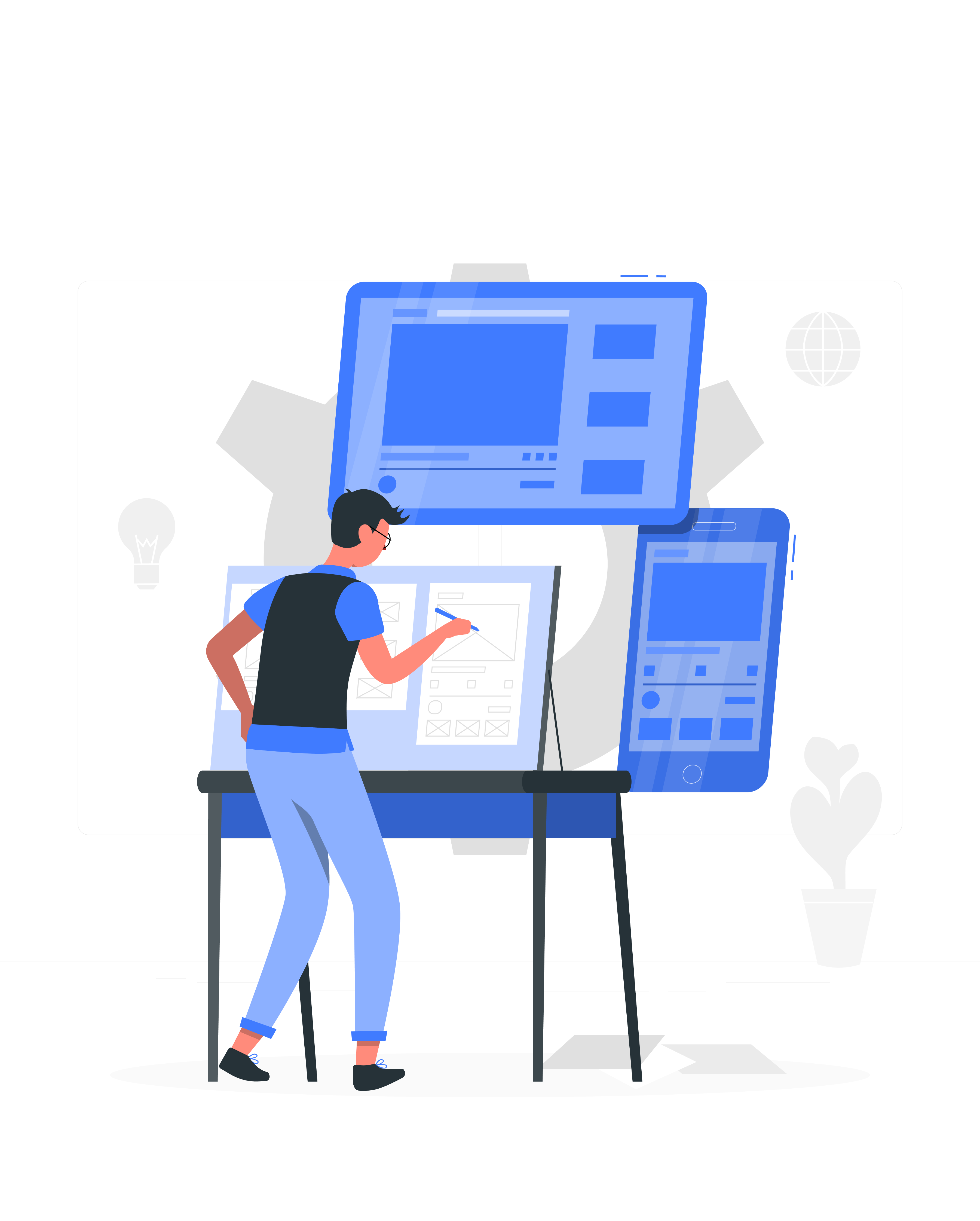
Final Visual Flow Prototype
Once Option 4 got approved, I started working on visual flow prototype.
• Website Prototype
• Mobile Prototype
Result & Evaluation
• Redesigning the Listing Page have resulted in positive impact on the User Experience.
• The new listing page has generated 10% more leads than the old listing page.
My Learnings
Thank you for reading! I am hoping you enjoyed this case study. I would love to connect with you for a discussion above case study
Thank You